
Sharon Machlis
Pedí visualizaciones y respondió:
There are many interesting variables we could visualize. Let me suggest a few possibilities:
Suggested next steps:
Can you create a histogram of game total scores to see the distribution of scoring?
Could you make a box plot comparing home vs away team scores?
Let's create a scatter plot of temperature vs total score to see if weather affects scoring.
Can you show me the distribution of betting spreads and how they relate to actual game results?
Could you create a visualization showing win/loss records by team?
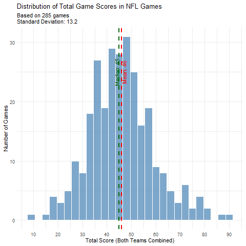
Which of these interests you, or would you like to explore something else in the data? I can help create any type of visualization you'd find useful!Pedí la trama del clima versus la puntuación, y escribió el código R que desafortunadamente no mostró una tendencia interesante. Luego, probé el histograma de la puntuación total, que devolvió el código R, las observaciones del bot y una trama. Databot luego proporcionó el siguiente análisis:
This visualization reveals several interesting patterns about NFL scoring:

1. The distribution looks approximately normal (bell-shaped), with some slight right skew
2. The mean total score is about 44.5 points
3. The median is very close to the mean at about 44 points
4. Most games fall between roughly 30 and 60 total points
5. There are a few outlier games with very high scoring (80+ points) and very low scoring (<20 points)
Sharon Machlis
Si bien muchos chatbots convencionales tienen capacidades similares, pocos escriben y ejecutan código R como este; IA generativa El código de análisis de datos es Típicamente hecho en Python.